Amazon UX Case Study

Feature addition in the AI based health platform: AWS HealthLake

Yes.. This is my solution

Without further ado... Lets dive straight into the project.
Wanna skip directly to the solution.
Yes please!
Role
User experience and interaction design
Duration
1.5 months
What I did
Everything - solo project
But wait. First lets understand the context..
AWS and its various products
The core domain that I chose was AI (Artificial Intelligence). After reading about its different products on the AWS site, I resonated the most with AWS HealthScribe and AWS HealthLake. On further exploration I chose AWS HealthLake for this project.

Amazon Q
An AI-powered assistant which is used for speeding up software development and making the most of companies' internal data.

AWS HealthLake
It manages and processes health information of patients or a large population quickly.
AWS HealthScribe
Its used to turn patient-clinician conversations into clinical notes automatically so that the clinician can view a synthesized summary of it.
Why did I choose HealthLake? The reasoning goes like this..
The addition of custom templates of the dashboards w.r.t. the particular use cases would lead to better analysis of the data by its users, thus saving their time.
Efficiency
I thought that in terms of the solution, HealthLake has more potential as I could solve for a larger audience.
Scope
One use case that I could solve for was a population dashboard for a pandemic like Covid-19, wherein the data analysis of a large group of people could be of use to the researchers /governments.
Impact
Who would be the key users?

Clinicians (Ms. Aayushi)
They would use the platform to assess patient’s medical history, ailments and their frequency of visits to the hospital.

Researchers (Mr. Anurag)
They would analyze the trends of diseases faced by a group of people based on their demographics.
It was certainly not a smooth ride..
Few of the challenges that were faced by me during the research:
Finding demos/screenshots of the product for reference
Finding users who have used a similar product in order to conduct primary research

Therefore most of the project was built on hypothesis and the knowledge that I have gathered through desk research.
Zoomed-out user flow in AWS HealthLake
Healthcare orgs
Structured and Unstructured Health data
Extract data with transactional API’s with SMART on FHIR capabilities
Analyze the health data in the form of a population dashboard
Zoomed-in user flow in AWS HealthLake
Import data into HealthLake
Create a database from imported data
Perform SQl queries
Open Quicksight console
Create Quicksight Viz of the data
Identifying the purpose of solving the problem aka the (Problem Statement)
Adding a new feature to the QuickSight environment which is currently being used to create data visualizations for data analysis.
The idea is to create customizable dashboard templates which has some relevant data viz in relation to the population dashboard, patient’s medical history and care gap analysis.
The solution would cater to the health orgs to utilize the template and fine tune it according to their needs.
For example - Care gap analysis can be done for various medical conditions/diseases such as cancer, diabetes and even certain mental health conditions such as depression.
The intent of this solution is that the clinicians/researchers who are new to creating dashboards working in the health orgs as well as the medical research centers can utilize the pre-made templates to focus on analyzing the data rather than building the dashboards from scratch which will eventually save their time. It would also reduce their learning curve and help them to kick-start their work.
Inspo taken from this you tube video available on Amazon QuickSight channel: https://shorturl.at/1Xzm5

Summary of the problem statement
To create templates of customizable dashboards which has a set of relevant data visualizations mapped to a population health dashboard, patient’s medical history and care gap analysis such that the medical professionals/researchers can leverage them to analyze the data faster, thus saving their time.
Enough of the ted talk..

Now lets focus on the positives of the platform a.k.a. what AWS HealthLake does right
There are many features/capabilities of the platform that are inspiring, but some of them are listed below:
Customization
The ability to add/play with the various settings, themes, etc creates a delight factor for the users.
Hierarchy of elements
The hierarchy of the key elements is on point. For eg. a quick action button like Add is present on the top which is highly accessible for the users.
Intuitiveness
The icons with the labels in the nav bar are highly intuitive and easy to understand.
Color scheme
Minimal colors are used in the UI, following the AWS brand identity.

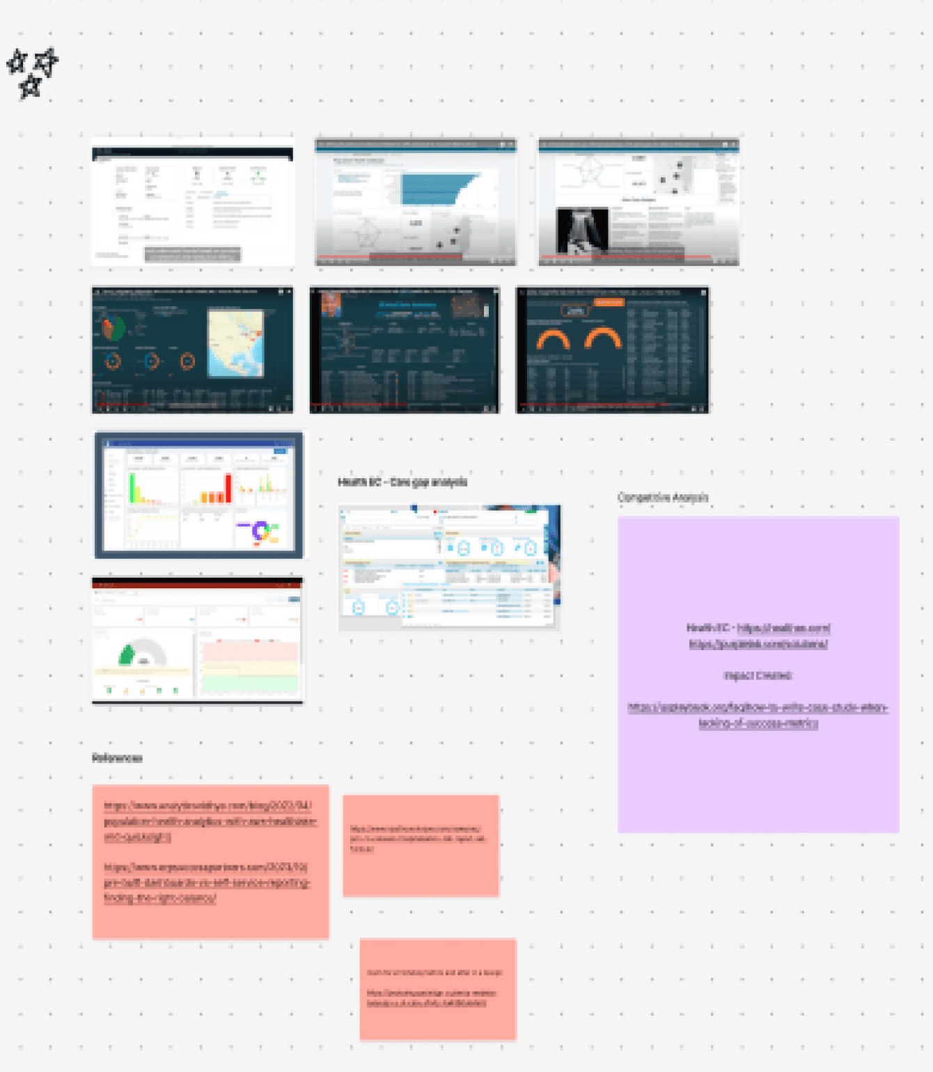
Snapshot of the interface for reference

Ding ding

Its solution time!

I started by looking at the Cloudscape design system..
Link to the AWS design system: https://cloudscape.design/
Therein, I picked up the colors, typo and components which would be used in the design phase.
Let’s go through the journey together which led me to the solution a.k.a how I executed the design phase

#1
Went through the site of AWS HealthLake and explored its various features/functionalities.
#2
Took screengrabs from AWS HealthLake workshop site of the dashboard created in QuickSight.


#3
Then I looked into a couple of you tube videos and captured how the risk stratification dashboard, patient’s medical history and care gap analysis would look like.
#4
Signed in the AWS HealthLake free account and explored the platform.


#5
Went through Amazon Q on the AWS site and tried to understand its interface and various offerings.
#6
Explored some QuickSight videos on you tube and came across an Amazon Q demo which gave me a head start to work towards my idea/solution.


My very own playground featuring all the work that goes behind finalizing the UI
Behind the scenes - Iterations
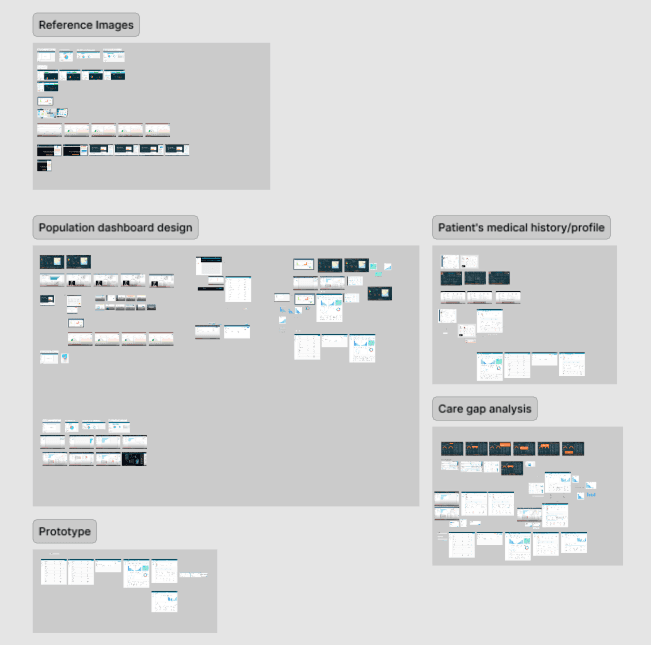
Low-fid sketches were created to get clarity on which components should be included in the UI screens


Howdy
Time to reveal the solution ( FYI - The UI and the flow will be similar to the current QuickSight console, my idea is to add a section which has pre-built templates which can be readily used by a medical professional ).
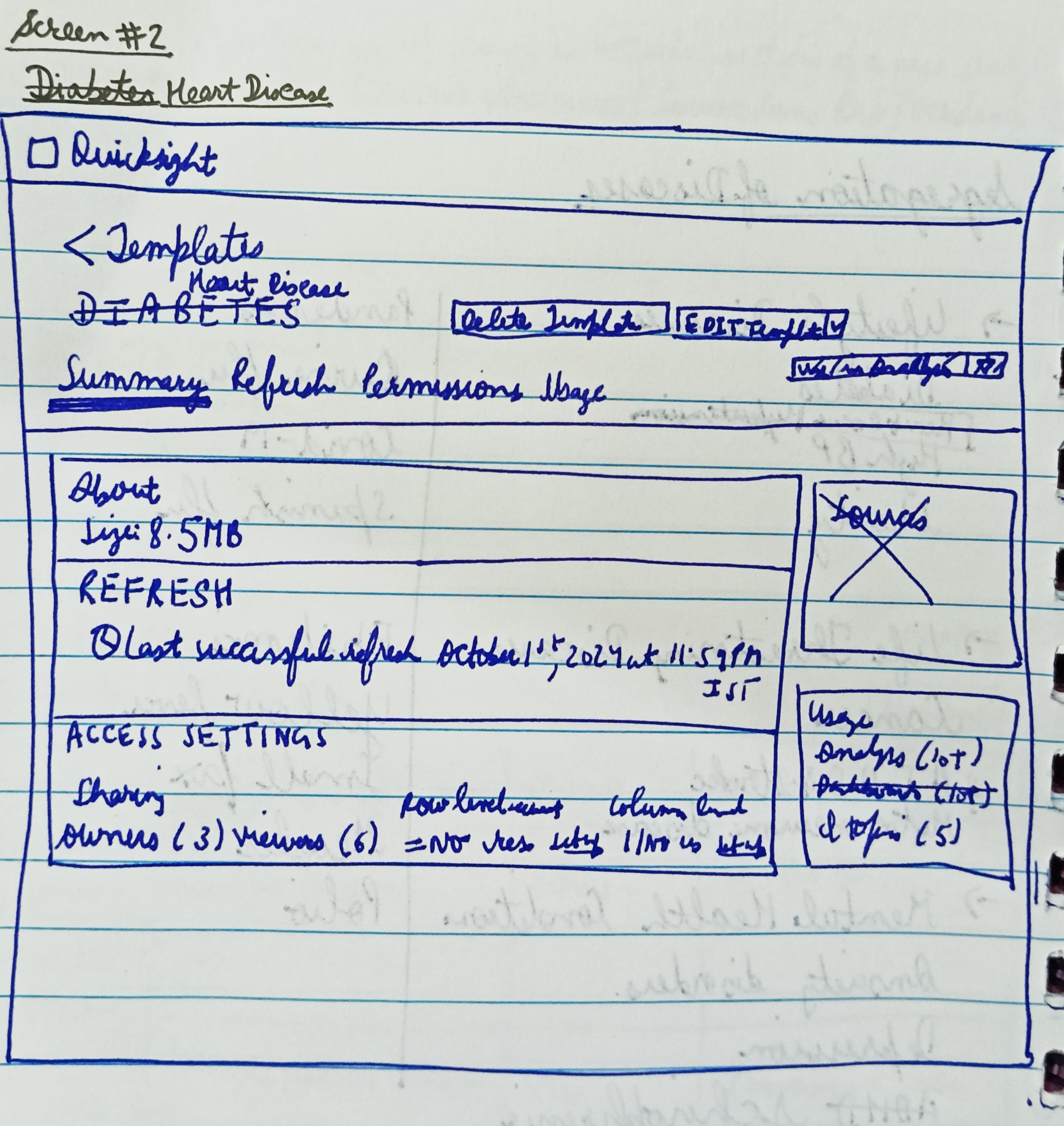
Segregation of diseases screen

In the QuickSight console, there will be an addition of templates section wherein there will be a table which has the types of diseases displayed like lifestyle diseases, old age diseases, etc which will be bifurcated further into their sub-types.
The other columns in the table will be same as the current UI of QuickSight.
Use in analysis screen

After clicking on a disease, we will get directed to the use in analysis screen which has the same UI experience as current Amazon Q.
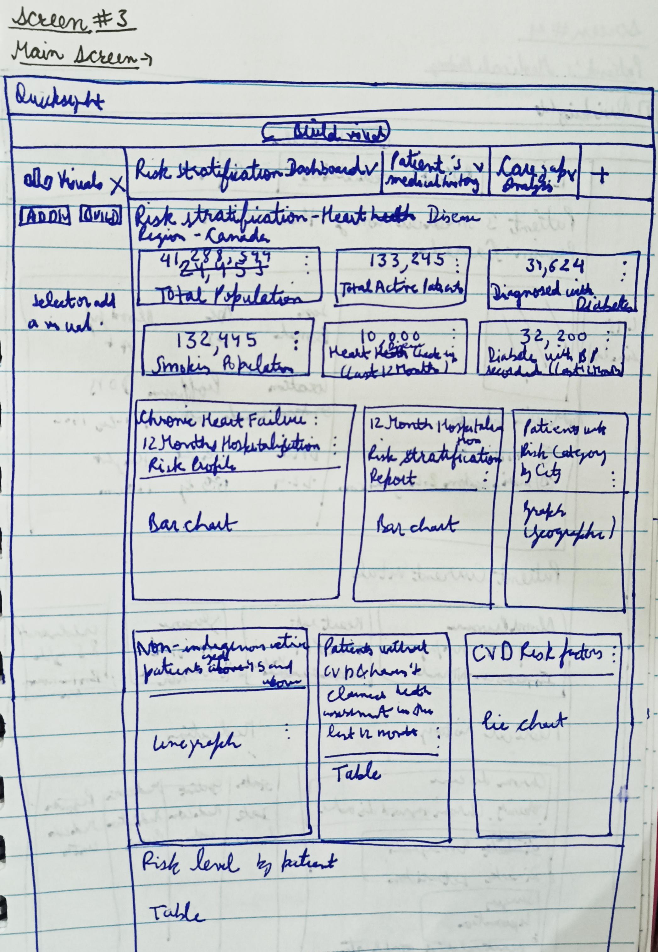
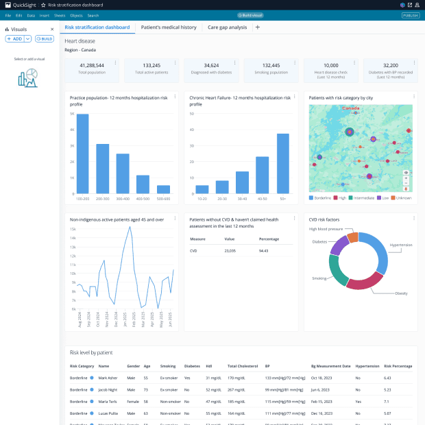
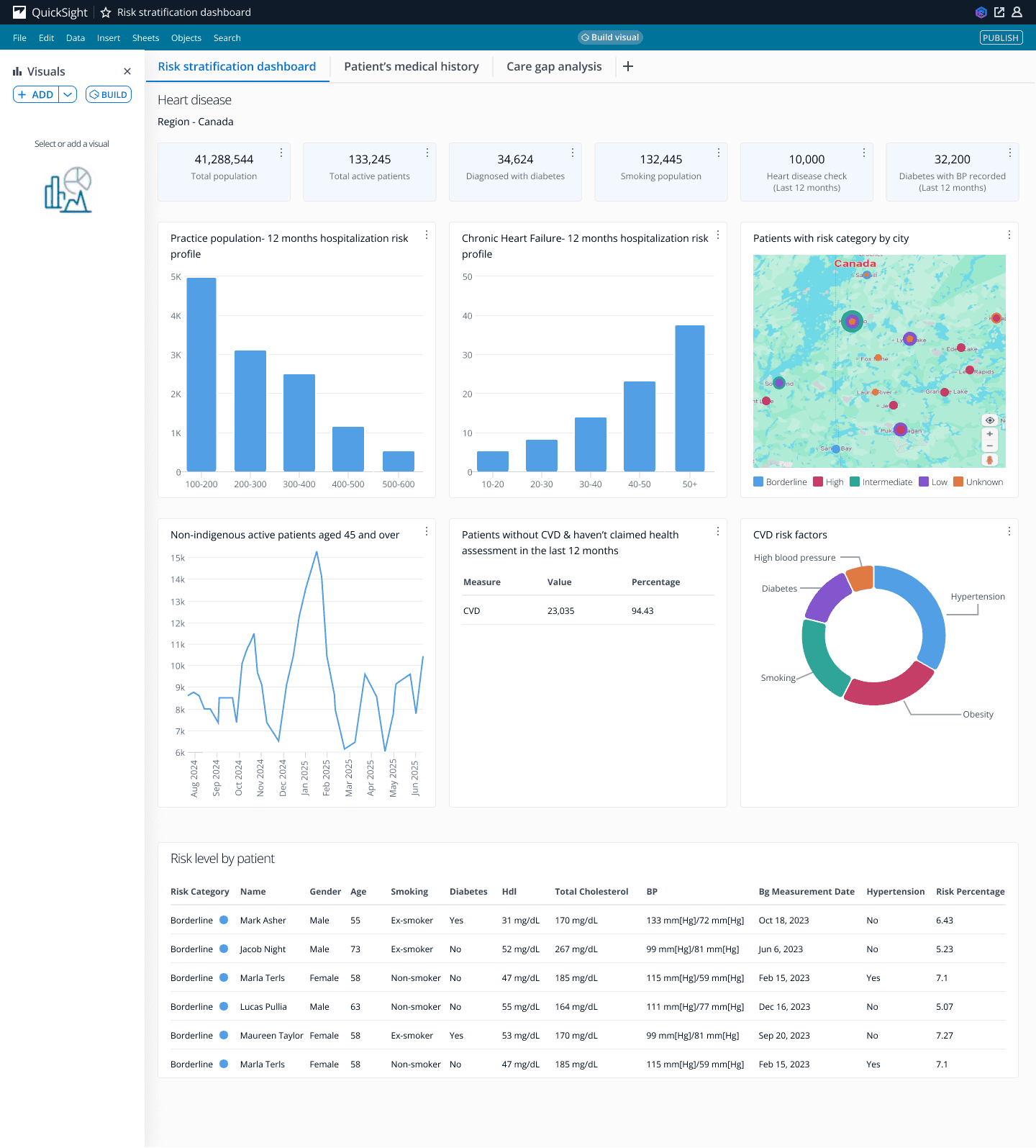
Population dashboard screen
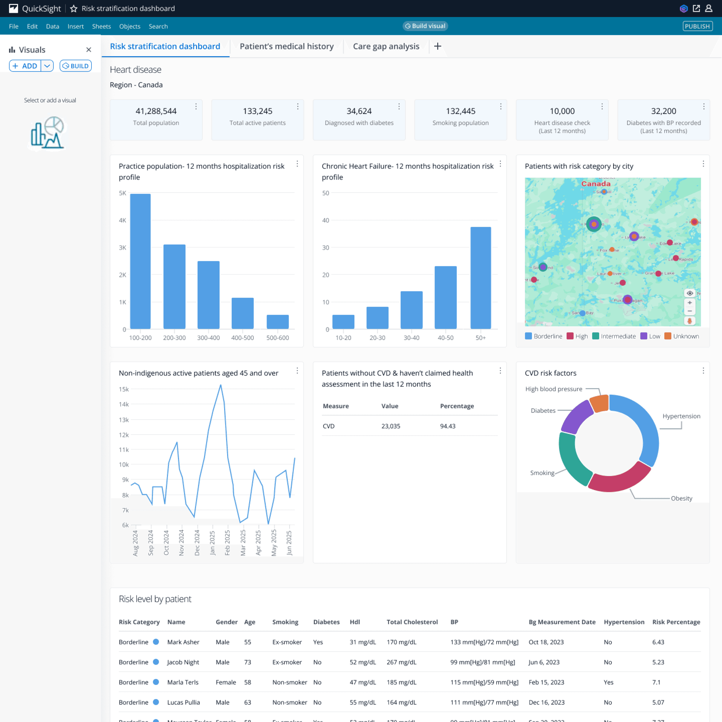
Risk stratification dashboard, patient’s medical history and care gap analysis were already created in HealthLake. I watched the demo on you tube, took screengrabs of the UI and tried to improve the UI by adding colors from Cloudscape design system, maintained a consistent light theme, added additional relevant data visualizations like charts and also took some data like the table from the HealthLake dashboard itself.
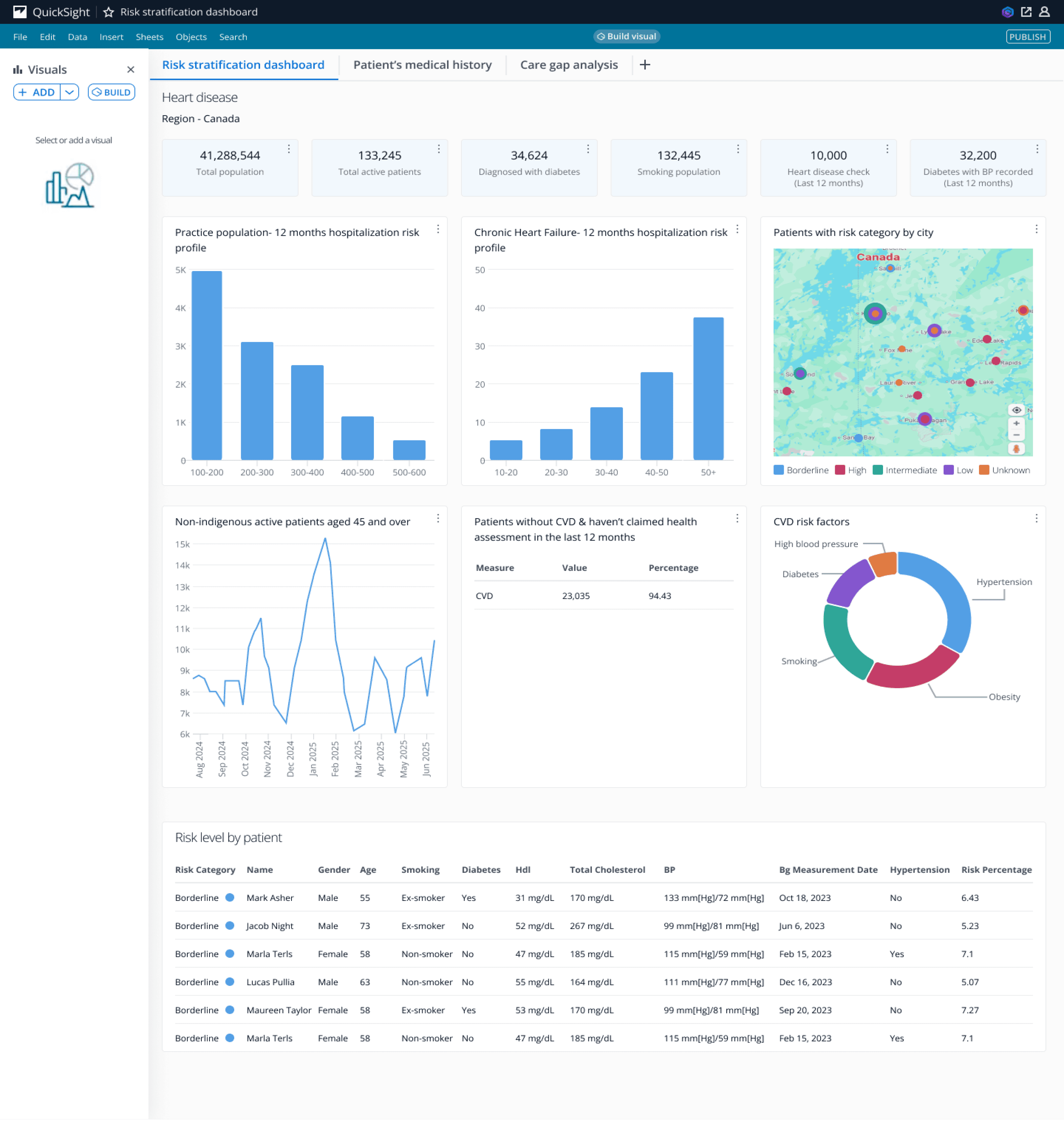
After clicking on use in analysis button, we can view the pre-built template of the risk stratification dashboard which includes relevant data for the user as the dashboard is specific to a particular region.
In this case, the region chosen is Canada which shows data like total active patients, smoking population, etc at the top.The dashboard also includes bar, line and donut charts.
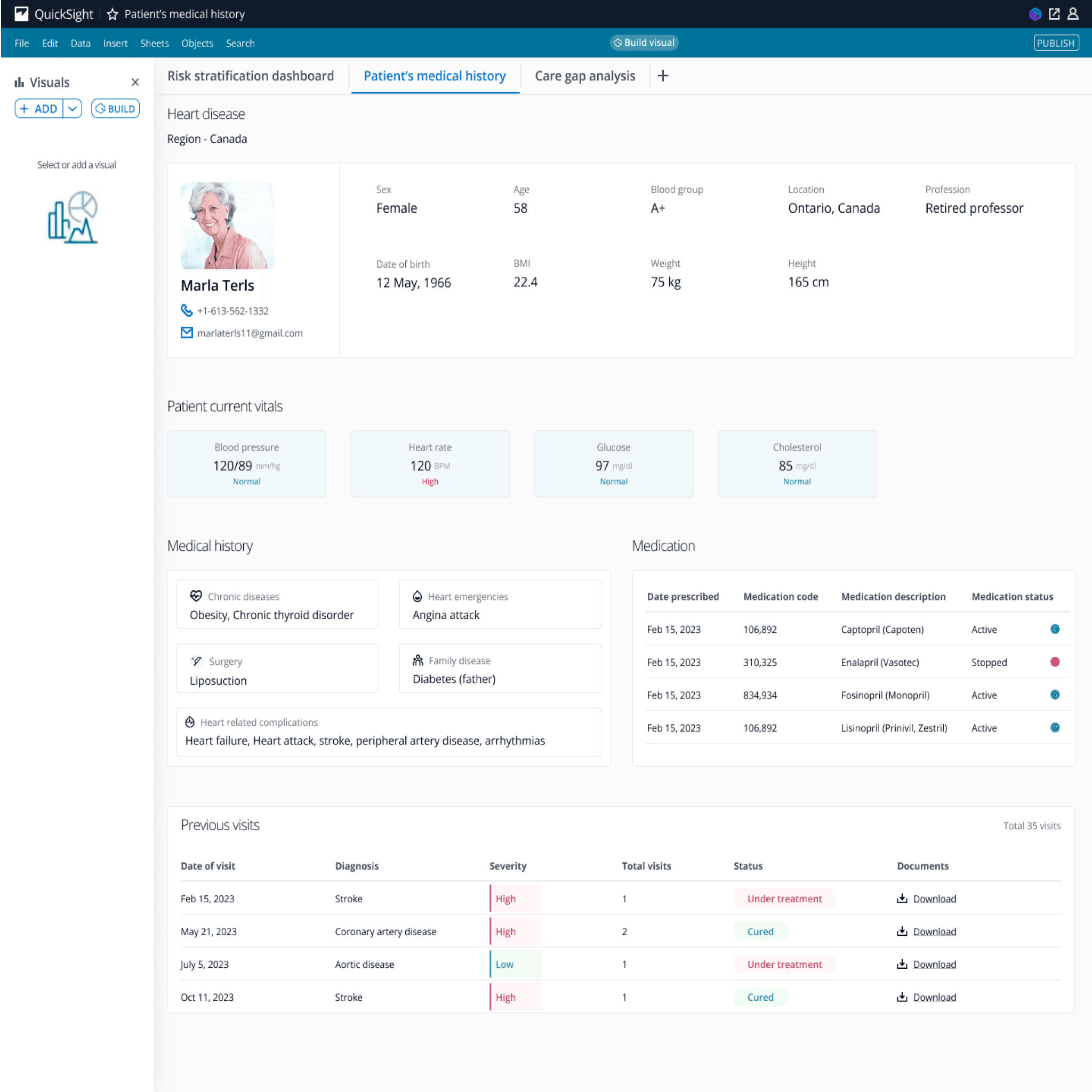
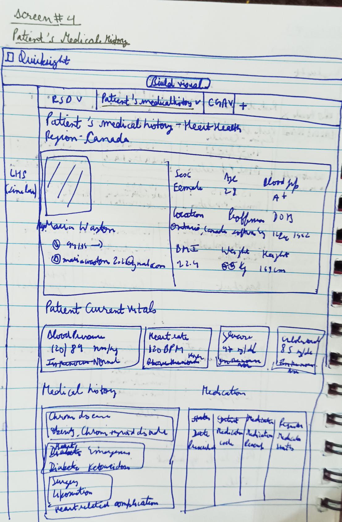
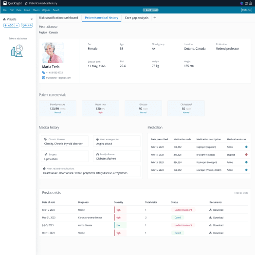
Patient’s medical history screen
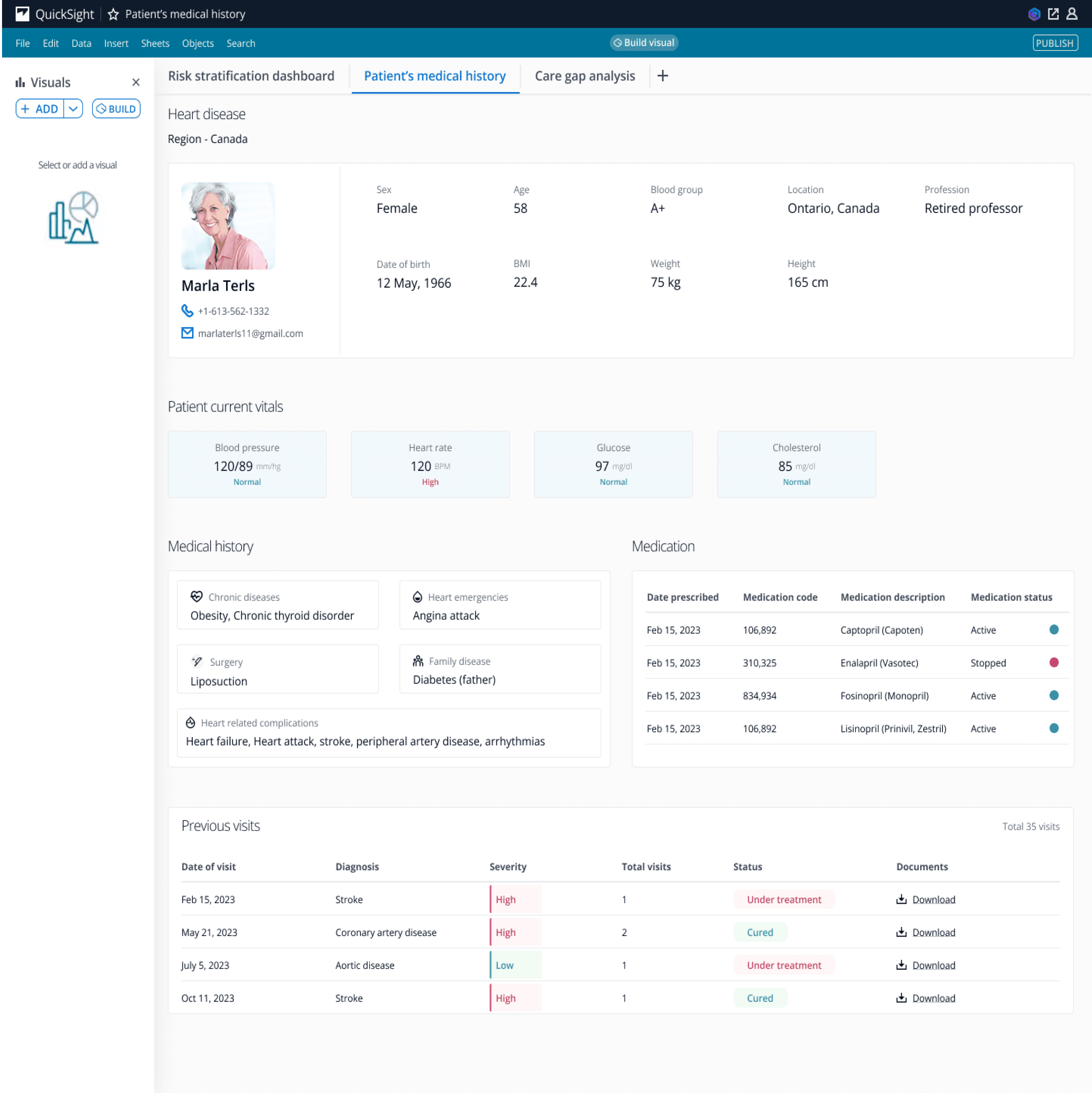
The second pre-built section includes all the info about the patient like their blood group, age, BMI, etc. It also has the patient’s current vitals, medical history and the medications which have been prescribed to them.
All their previous visits will also be recorded in the form of a table. There will be a provision to download the document which will have the detailed info about their visits and what all had been consulted to them.
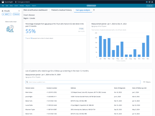
Care gap analysis screen
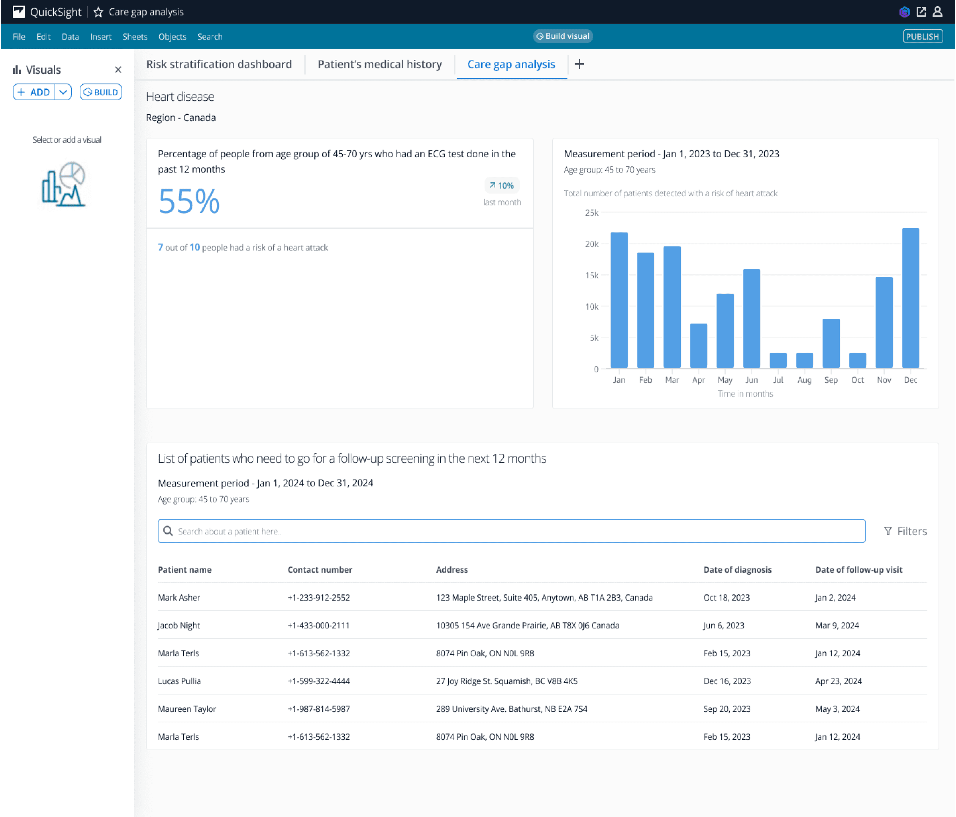
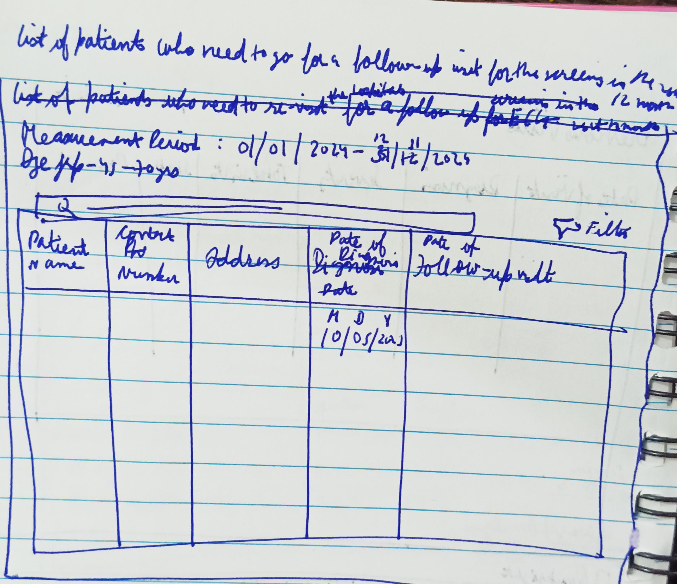
This section will have info like the % age of people who had an ECG in the past 12 months, a bar graph which shows the total number of patients which have the risk of a heart attack and also a table showing the list of patients who need to go for a follow-up screening in the next 12 months.
View of the flow of screens in form of a prototype video
Now comes the fun part
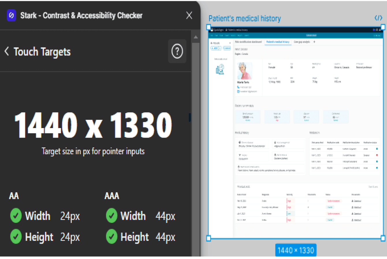
Did a quick accessibility check for all the UI screens
Found a plugin on figma which does contrast and accessibility check - Stark
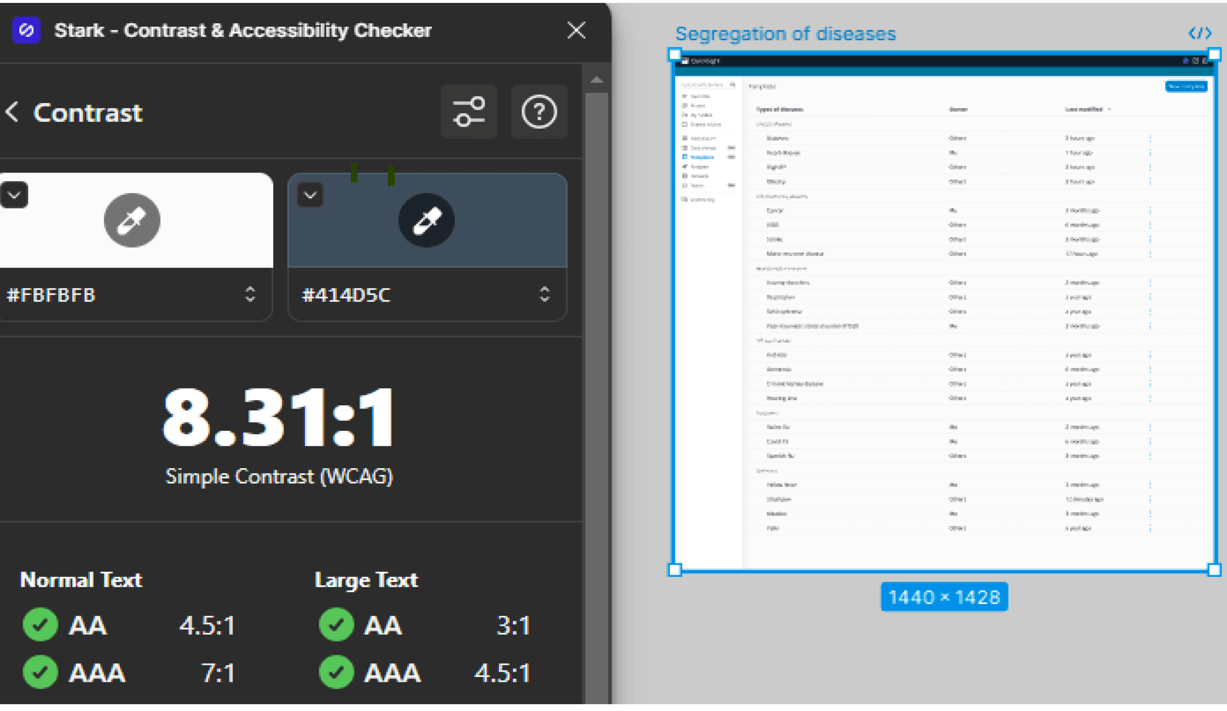
Contrast check
The Stark plugin does AA as well as AAA checks for contrast according to the WCAG standard.
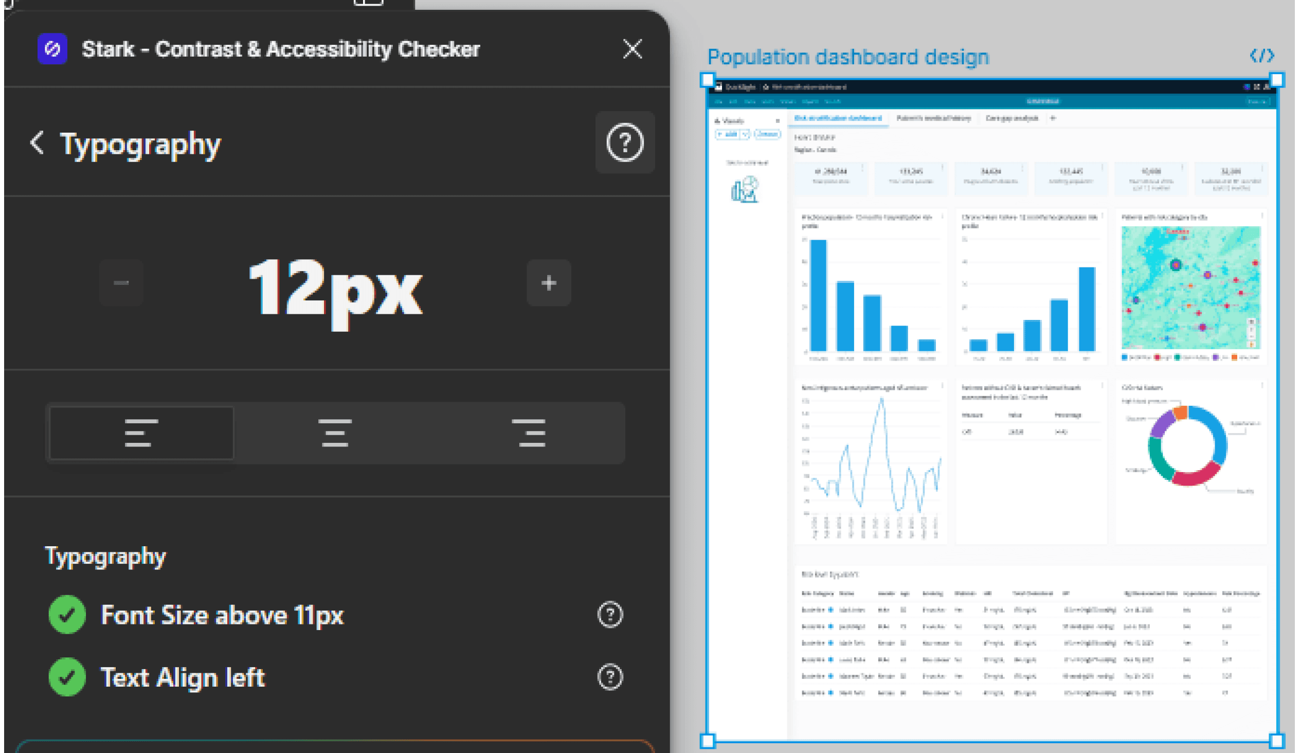
Typography check
The plugin checks for the ideal font size and text alignment.
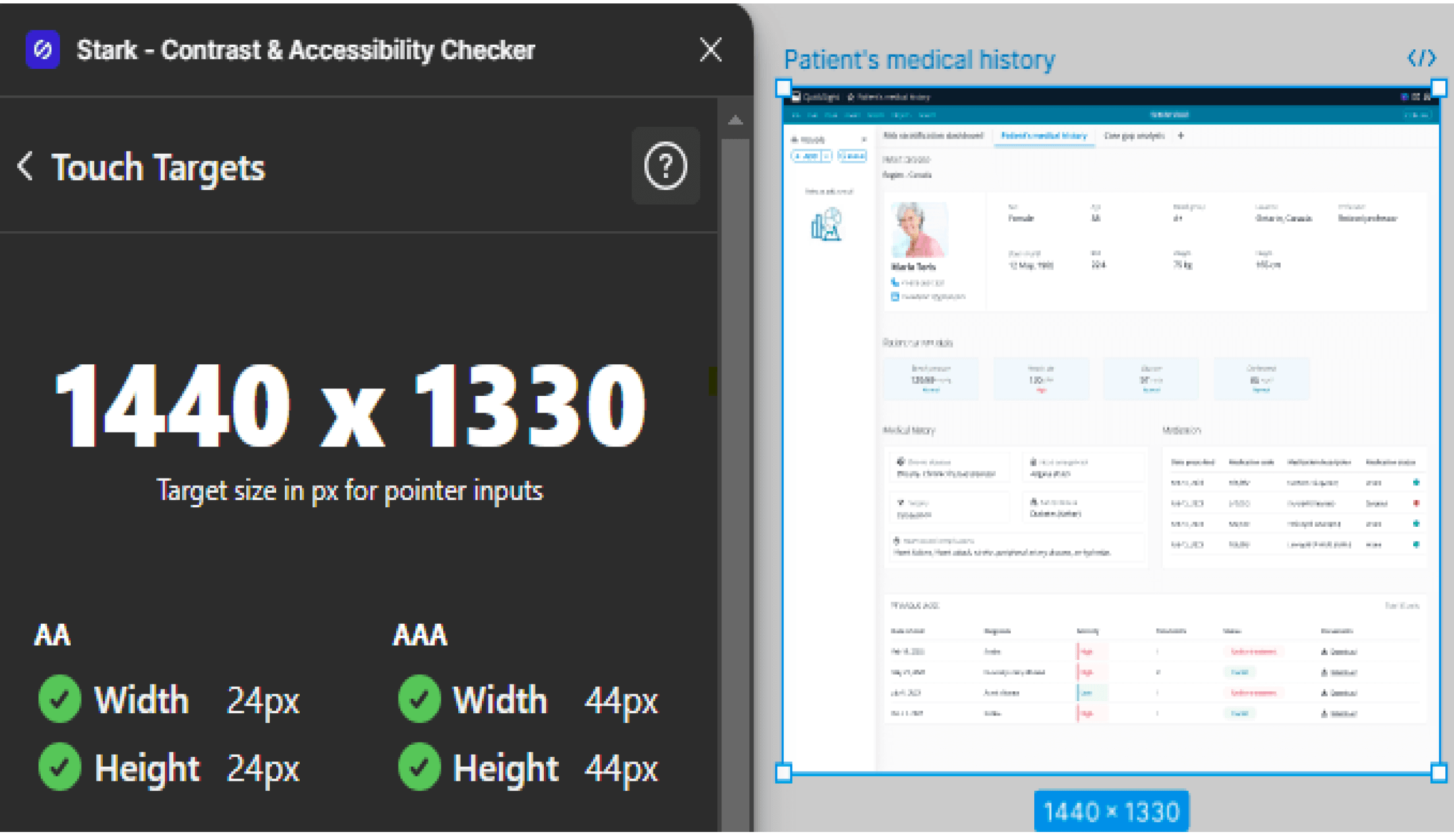
Touch targets
The plugin checks for the recommended target size.
The result was that the UI screens successfully passed the three accessibility checks.
What’s a solution without its impact on the business
#1
The templates are easy to use and intuitive, which will increase efficiency and save time of the clinicians.
#2
As there will be a pre-built dashboard, the training and support cost can be reduced for medical professionals who have been recently onboarded.
Takeaways / What could have been done better
There was not a SME or a BA or a PM, but still I managed to work on this project and came up with a solution. Sometimes just a spark is enough.
With no access to the users who used AWS HealthLake or Amazon Q, this project heavily depended on the secondary research and whatever was available on the AWS website, you tube channel and workshop site.
In terms of user testing, usability testing tools could have been used like Maze for prototype testing with the users (in my case did not have direct access to them) to get better insights on the user experience of the solution.
After getting feedback and insights from the users, I could have got some quantitative and qualitative data which could have been measured to understand the business impact/potential value generated by the solution.


Amazon UX Case Study
Feature addition in the AI based health platform: AWS HealthLake
Yes.. This is my solution
Without further ado... Lets dive straight into the project.
Wanna skip directly to the solution.
Yes sure!
Role
User experience and interaction design
Duration
1.5 months
What I did
Everything - solo project
But wait. First lets understand the context..
AWS and its various products
The core domain that I chose was AI (Artificial Intelligence). After reading about its different products on the AWS site, I resonated the most with AWS HealthScribe and AWS HealthLake. On further exploration I chose AWS HealthLake for this project.

Amazon Q
An AI-powered assistant which is used for speeding up software development and making the most of companies' internal data.

AWS HealthLake
It manages and processes health information of patients or a large population quickly.
AWS HealthScribe
Its used to turn patient-clinician conversations into clinical notes automatically so that the clinician can view a synthesized summary of it.
Why did I choose HealthLake? The reasoning goes like this..
I thought that in terms of the solution, HealthLake has more potential as I could solve for a larger audience.
Scope
The addition of custom templates of the dashboards w.r.t. the particular use cases would lead to better analysis of the data by its users, thus saving their time.
Efficiency
One use case that I could solve for was a population dashboard for a pandemic like Covid-19, wherein the data analysis of a large group of people could be of use to the researchers/governments.
Impact
Who would be the key users?
Clinicians (Ms. Aayushi)
They would use the platform to assess patient’s medical history, ailments and their frequency of visits to the hospital.
Researchers (Mr. Anurag)
They would analyze the trends of diseases faced by a group of people based on their demographics.
It was certainly not a smooth ride..

Few of the challenges that were faced by me during the research:
Finding demos/screenshots of the
product for reference
Finding users who have used a similar product in order to conduct primary research
Therefore most of the project was built on hypothesis and the knowledge that I have gathered through desk research.
Zoomed-out user flow in AWS HealthLake
Healthcare orgs
Structured and Unstructured Health data
Extract data with transactional API’s with SMART on FHIR capabilities
Analyze the health data in the form of a population dashboard
Import data into HealthLake
Create a database from imported data
Perform SQl queries
Open Quicksight console
Create Quicksight Viz of the data
Identifying the purpose of solving the problem aka the (Problem Statement)

Adding a new feature to the QuickSight environment which is currently being used to create data visualizations for data analysis.
The idea is to create customizable dashboard templates which has some relevant data viz in relation to the population dashboard, patient’s medical history and care gap analysis.
The solution would cater to the health orgs to utilize the template and fine tune it according to their needs.
For example - Care gap analysis can be done for various medical conditions/diseases such as cancer, diabetes and even certain mental health conditions such as depression.
The intent of this solution is that the clinicians/researchers who are new to creating dashboards working in the health orgs as well as the medical research centers can utilize the pre-made templates to focus on analyzing the data rather than building the dashboards from scratch which will eventually save their time. It would also reduce their learning curve and help them to kick-start their work.
Inspo taken from this you tube video available on Amazon QuickSight channel: https://shorturl.at/1Xzm5
Summary of the problem statement
To create templates of customizable dashboards which has a set of relevant data visualizations mapped to a population health dashboard, patient’s medical history and care gap analysis such that the medical professionals/researchers can leverage them to analyze the data faster, thus saving their time.
Enough of the ted talk..
Now lets focus on the positives of the platform a.k.a. what
AWS HealthLake does right
There are many features/capabilities of the platform that are inspiring, but some of them are listed below:
Customization
The ability to add/play with the various settings, themes, etc creates a delight factor for the users.
Hierarchy of elements
The hierarchy of the key elements is on point. For eg. a quick action button like Add is present on the top which is highly accessible for the users.
Intuitiveness
The icons with the labels in the nav bar are highly intuitive and easy to understand.
Color scheme
Minimal colors are used in the UI, following the AWS brand identity.
Snapshot of the interface for reference

Ding ding
Its solution time!

I started by looking at the Cloudscape design system..
Link to the AWS design system: https://cloudscape.design/
Therein, I picked up the colors, typo and components which would be used in the design phase.
Let’s go through the journey together which led me to the solution aka how I executed the design phase
#1
Went through the site of AWS HealthLake and explored its various features/functionalities.
#2
Took screengrabs from AWS HealthLake workshop site of the dashboard created in QuickSight.
#3
Then I looked into a couple of you tube videos and captured how the risk stratification dashboard, patient’s medical history and care gap analysis would look like.
#4
Signed in the AWS HealthLake free account and explored the platform.
#5
Went through Amazon Q on the AWS site and tried to understand its interface and various offerings.
#6
Explored some QuickSight videos on you tube and came across an Amazon Q demo which gave me a head start to work towards my idea/solution.
My very own playground featuring all the work that goes behind finalizing the UI
Behind the scenes - Iterations
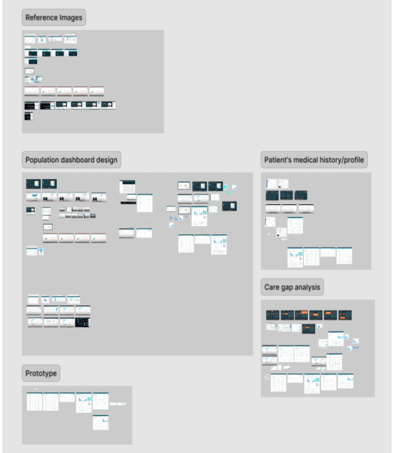
Low-fid sketches were created to get clarity on which components should be included in the UI screens
Howdy
Time to reveal the solution ( FYI - The UI and the flow will be similar to the current QuickSight console, my idea is to add a section which has pre-built templates which can be readily used by a medical professional ).
Segregation of diseases screen
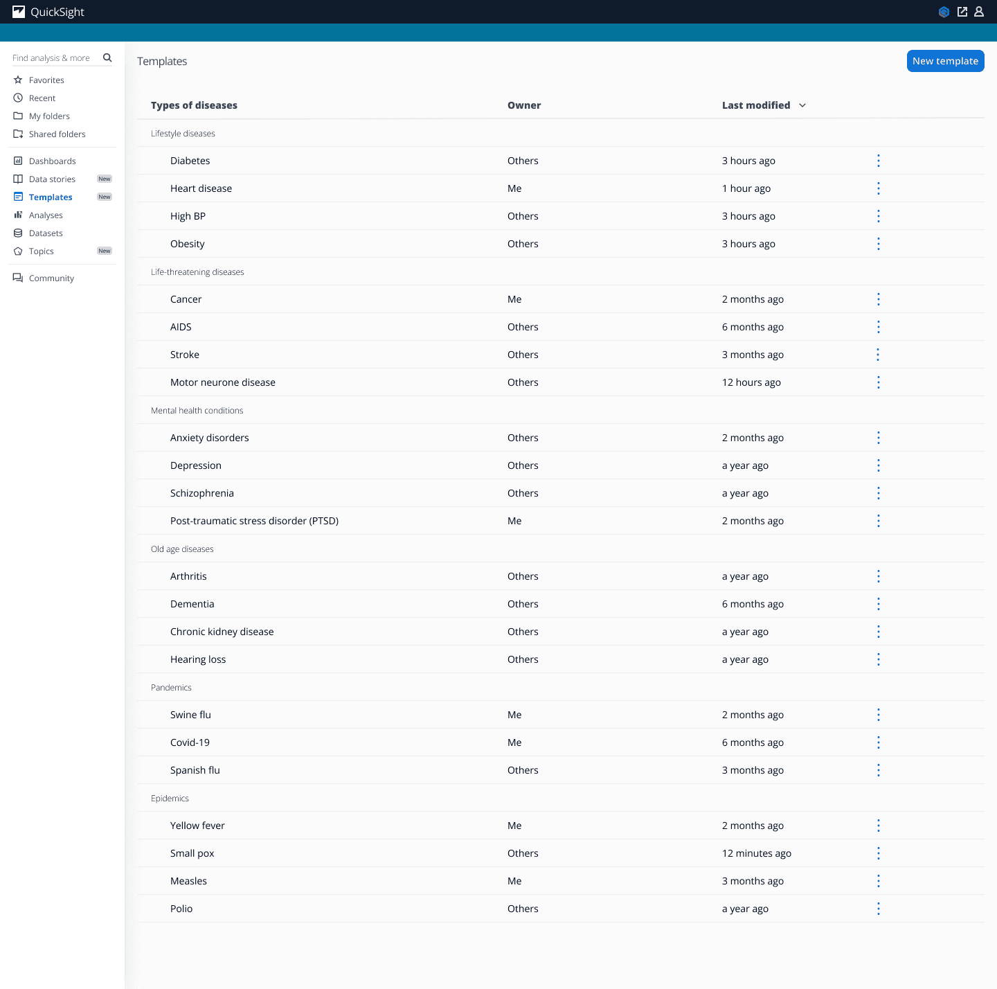
In the QuickSight console, there will be an addition of templates section wherein there will be a table which has the types of diseases displayed like lifestyle diseases, old age diseases, etc which will be bifurcated further into their sub-types.
The other columns in the table will be same as the current UI of QuickSight.
Use in analysis screen
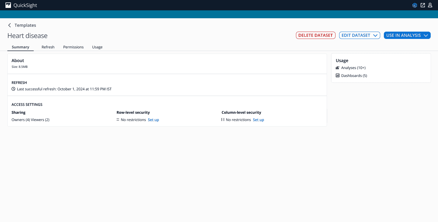
After clicking on a disease, we will get directed to the use in analysis screen which has the same UI experience as current Amazon Q.
Population dashboard screen
Risk stratification dashboard, patient’s medical history and care gap analysis were already created in HealthLake. I watched the demo on you tube, took screengrabs of the UI and tried to improve the UI by adding colors from Cloudscape design system, maintained a consistent light theme, added additional relevant data visualizations like charts and also took some data like the table from the HealthLake dashboard itself.
After clicking on use in analysis button, we can view the pre-built template of the risk stratification dashboard which includes relevant data for the user as the dashboard is specific to a particular region.
In this case, the region chosen is Canada which shows data like total active patients, smoking population, etc at the top.
The dashboard also includes bar, line and donut charts.
Patient’s medical history screen
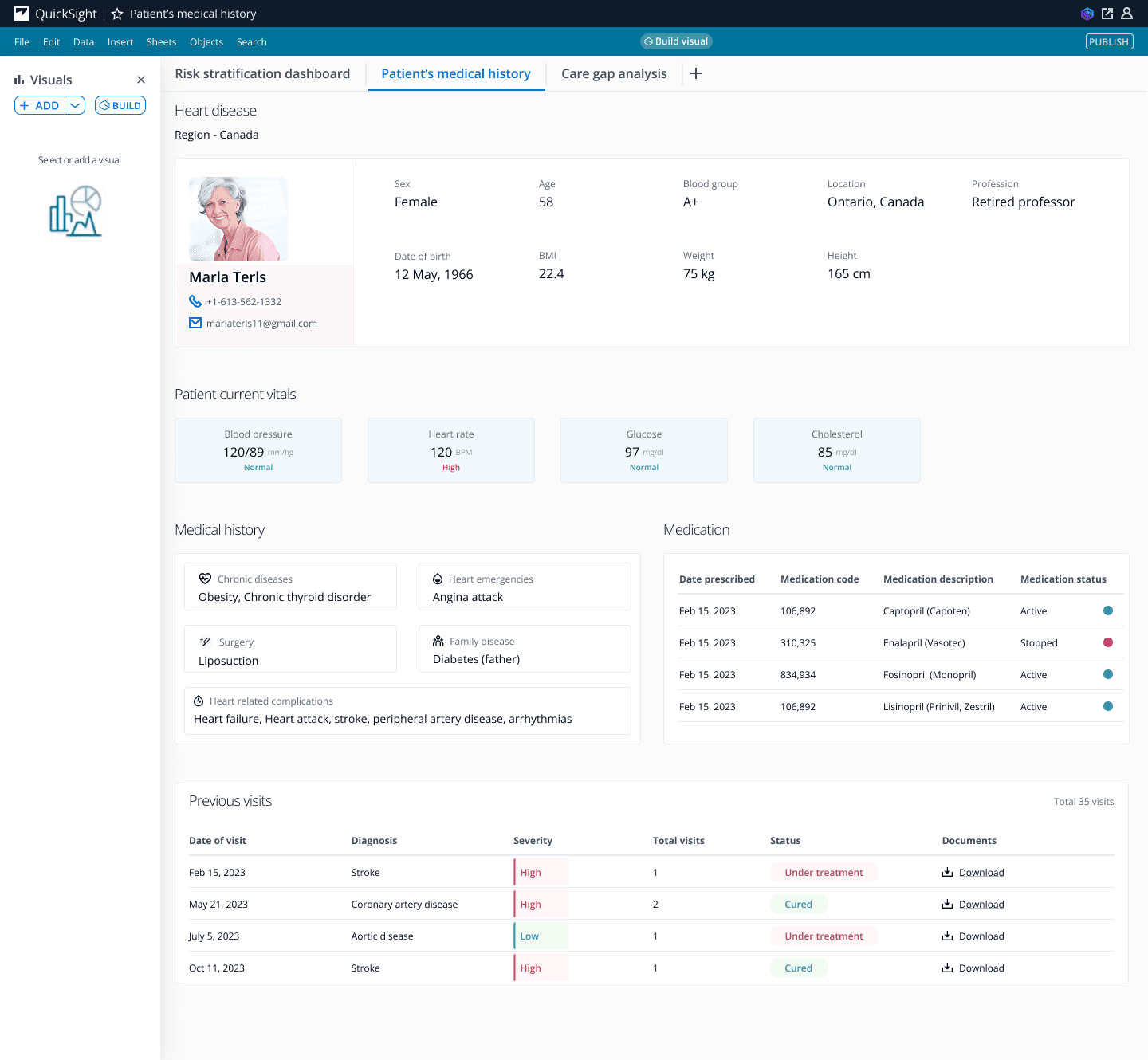
The second pre-built section includes all the info about the patient like their blood group, age, BMI, etc.
It also has the patient’s current vitals, medical history and the medications which have been prescribed to them.
All their previous visits will also be recorded in the form of a table. There will be a provision to download the document which will have the detailed info about their visits and what all had been consulted to them.
Care gap analysis screen
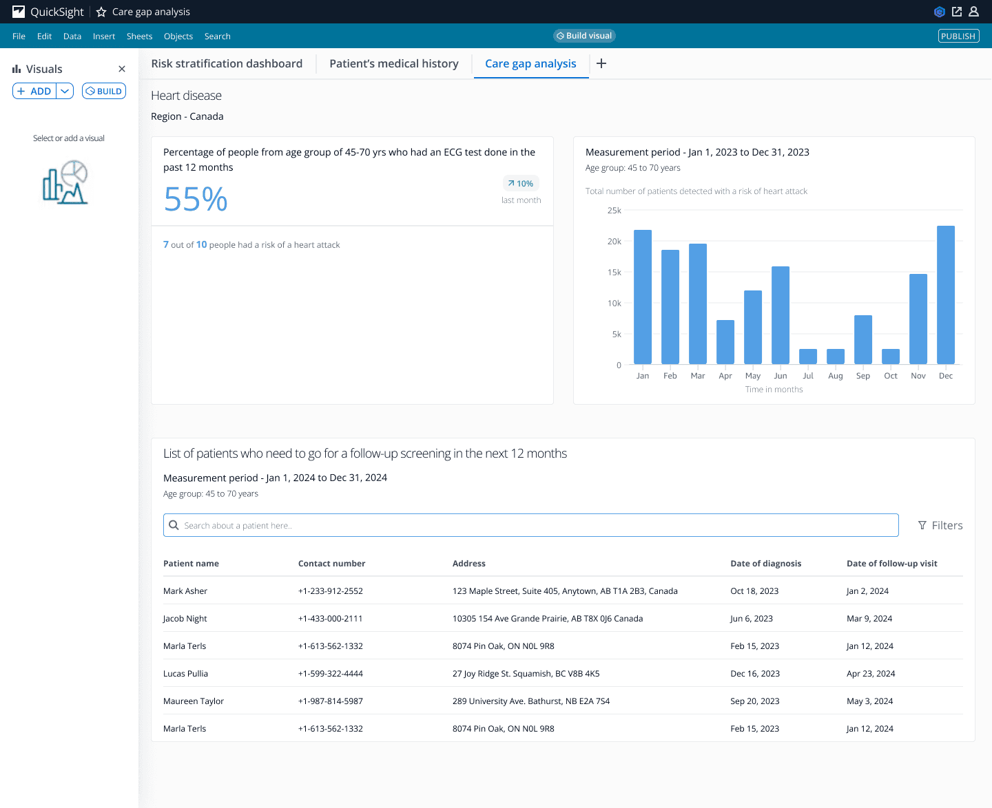
This section will have info like the % age of people who had an ECG in the past 12 months, a bar graph which shows the total number of patients which have the risk of a heart attack and also a table showing the list of patients who need to go for a follow-up screening in the next 12 months.
View of the flow of screens in form of a prototype video
Now comes the fun part
Did a quick accessibility check for all the UI screens
Found a plugin on figma which does contrast and accessibility check - Stark
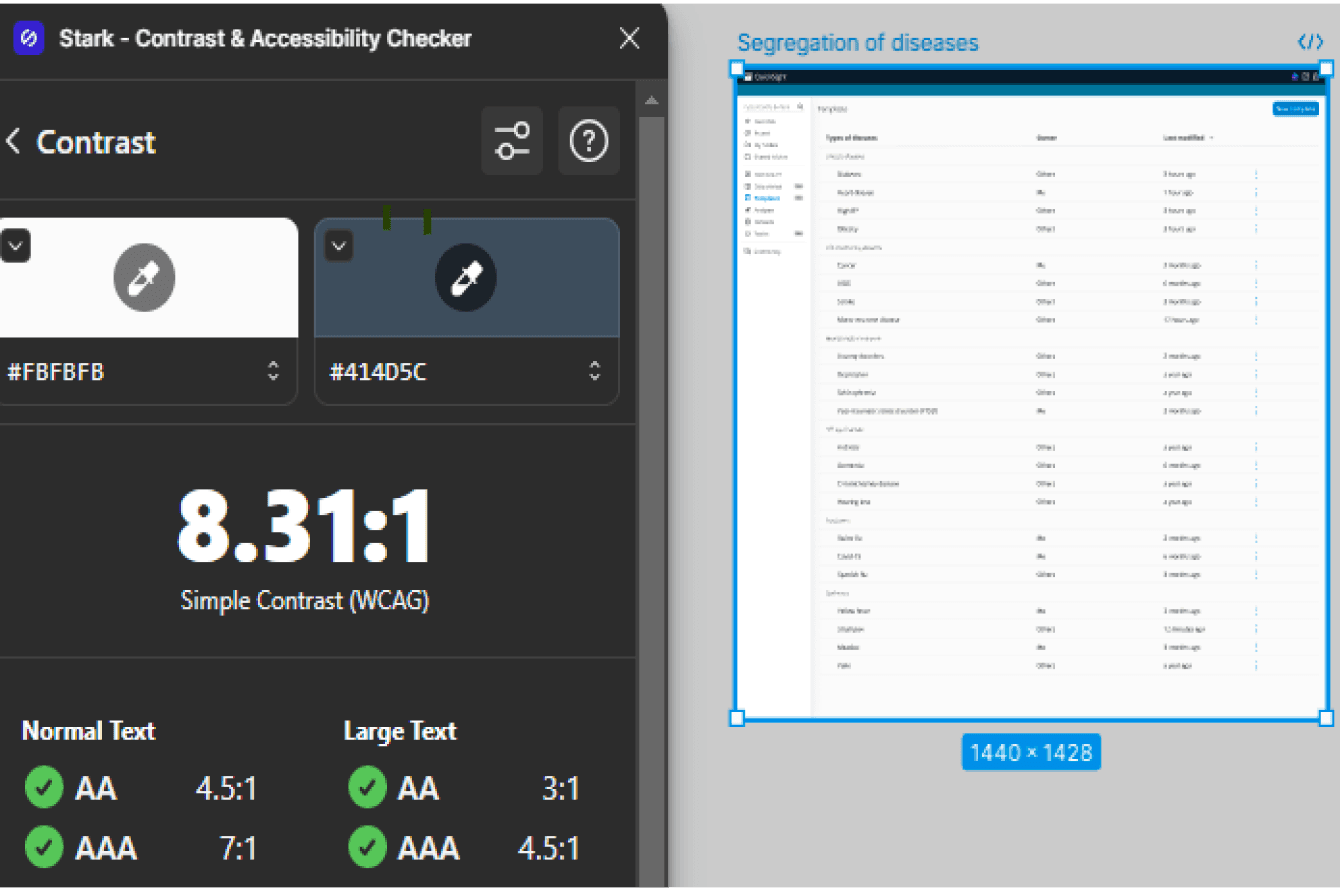
Contrast check
The Stark plugin does AA as well as AAA checks for contrast according to the WCAG standard.

Typography check
The plugin checks for the ideal font size and text alignment.
Touch targets
The plugin checks for the recommended target size.
The result was that the UI screens successfully passed the three accessibility checks.
What’s a solution without its impact on the business
#1
The templates are easy to use and intuitive, which will increase efficiency and save time of the clinicians.
#2
As there will be a pre-built dashboard, the training and support cost can be reduced for medical professionals who have been recently onboarded.
Takeaways / What could have been done better
There was not a SME or a BA or a PM, but still I managed to work on this project and came up with a solution. Sometimes just a spark is enough.
With no access to the users who used AWS HealthLake or Amazon Q, this project heavily depended on the secondary research and whatever was available on the AWS website, you tube channel and workshop site.
In terms of user testing, usability testing tools could have been used like Maze for prototype testing with the users (in my case did not have direct access to them) to get better insights on the user experience of the solution.
After getting feedback and insights from the users, I could have got some quantitative and qualitative data which could have been measured to understand the business impact/potential value generated by the solution.