Redesign of Self-Directed Investing site by J.P. Morgan Wealth Management


Role
User experience and interaction design
Duration
1.5 months
What I did
Everything - solo project
Lets cut the chase and skip directly to the solution. Shall we?
Click me
Introduction
What are we looking at?
The process that I followed to identify the problem -
Went to the official website of J.P. Morgan
Opened the Chase site
Got to the Investing by J.P. Morgan tab on the top navigation bar
Came across Invest on your own page, which will be the topic of this case study
User experience/User Interface issues identified while going through the landing page of Self-Directed Investing site
Branding of the landing page does not match with the General Investment/Traditional IRA/ Roth IRA pages.
Since it is an independent investing portal, all the pages should have consistent branding and they should look cohesive to the end user.
The solution provided will be applicable for the mobile interface as well.
The other problem identified was that when the user clicks on the FAQ section on the hamburger menu, the page opens in a completely different site which is not a good user experience.
Listing the business goals tied to the above stated UX issues
Consistent UI will promote brand loyalty and reduce drop-off rates.
By reducing the number of clicks and avoiding the user being redirected to a completely different site just to view the FAQs, conversion rates will increase, and abandonment rates will dramatically decrease.
Good user experience across the devices will be helpful in building positive brand perception.
Research
According to the Diverse Investor study 2024, majority of the users who had a Self-Directed Investing account were millennials (60%).
Naturally, my next step will be to understand their behaviors, wants and needs
It should be easy for the user to navigate in the portal.
The site should provide a personalized experience.
Consistent user experience should be followed for the mobile app as well since the millennials prefer mobile-first design.
Self-service option like FAQ’s should be readily available so that they can find information quickly.
These are some of the pointers that I kept in mind while designing the solution.
Defining the problem
Problem statement/Challenge
Redesigning the Self-Directed Investing homepage and improving the user experience of its adjacent pages like General Investment, Traditional IRA, Roth IRA and FAQ so that the site gets repeat customers.
Before unfolding the solution, let’s dive into some of the “How might we” statements
How might we improve the user experience/engagement of the Self-Directed Investing site?
How might we add a delight factor to the landing page by making is consistent to the other pages, so that the user explores the entire site?
How might we design for both platforms (desktop and mobile) to ensure users have a consistent experience across the product?
How might we reduce the number of clicks so that users can easily complete their tasks, thereby saving time?
Current user flow
Landing page
of Self-
Directed
Investing site
Click on
the open
account CTA
Modal pops
up with three
options to
choose from
User clicks one
of the options
and the
relevant page opens
User has to go back again and click on the CTA to select other option on the modal
If user has any question he clicks on the FAQ link in hamburger menu
FAQ link redirects the user to a new site
Time consuming process
Optimized user flow
Redesigned
landing page
of the Self-
Directed
Investing site
Click on
the open
account CTA
User gets
redirected to a
page which
has three
tabs i.e. General Investment,
Traditional IRA
and Roth IRA
If user has
any question he
clicks on FAQ
link on the
same page
FAQ section is available on the landing page
Lesser clicks which means more time saved!
Utilizing the Salt design system to create high-fidelity designs
Leveraging the design system which includes reusable components, typography, color palettes and iconography to give a UX makeover to the Self-Directed Investing site.
Reference link to the Salt design system: https://www.saltdesignsystem.com/salt/getting-started/designing

Ideation phase
Introducing the low-fidelity wireframes which will help in creating the layout of the solution (it will also act as a guiding light for the solution)
Desktop
Landing page


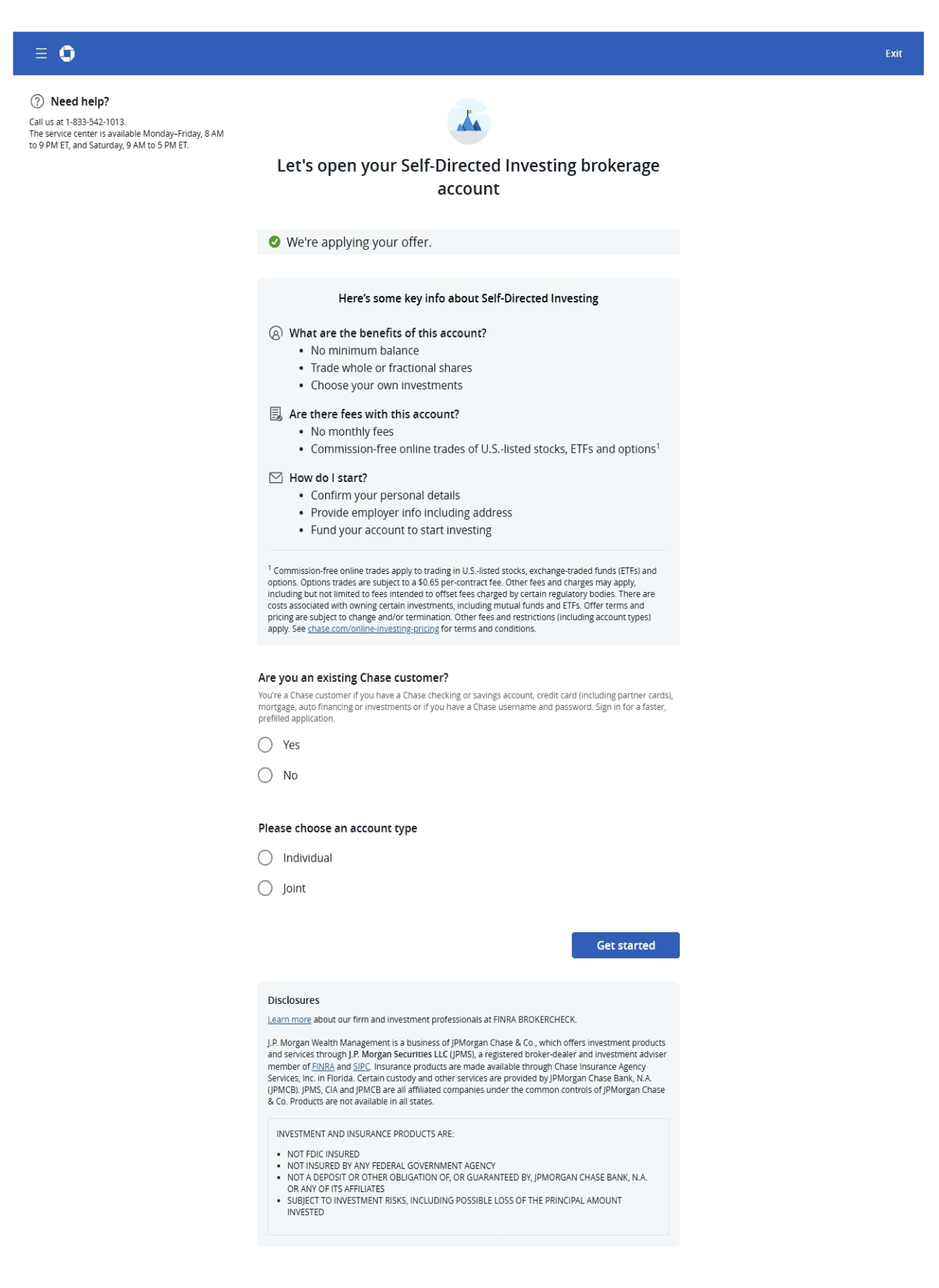
Open an account page


Mobile
Homepage


Open an account page

My playground


Solution
Revealing the final solution a.k.a the high-fidelity designs
Landing page (Desktop)
Before

After

Inconsistent usage of colors creates a disconnect in the mind of the user, so the first step is to make it consistent throughout the page.
Removing the hamburger menu and instead, introducing tab design as it is a preferred practice in desktop view.
Including imagery in the hero section, to enhance the look of the page.
The layout and hierarchy of the page is also improved, as the important section like choosing a type of account is moved to the top.
On click of ‘Click to open account’ CTA, earlier a modal appeared, so now in the redesign instead of redirection of the types of account pages to three separate pages, I clubbed them into one page and introduced tab design to reduce the number of clicks.
In the before version, the FAQs were hidden in the hamburger menu and it was redirecting to a separate page with different branding, so to make it convenient for the user to view the FAQs I added them at the top of the footer.
Text of the footer is reduced and it is properly organized.
General Investment page (Desktop)
Before

After

The user can easily switch between pages through the tabs at the top.
Including a short description for each type of account page, to remove decision fatigue for the user.
In the previous UI, the content was center-aligned but in order to maintain consistency with the landing page, I left-aligned it.
Shifting the need help container above the footer in the new layout.
FYI: For the Traditional IRA and Roth IRA pages, majority of the content remains similar to the General Investment page with minor changes like description and headings.
Prototype: Desktop
Prototype: Mobile
Did a quick accessibility check for all the UI screens
Found a plugin on Figma which does contrast and accessibility check - Stark

Contrast check
The Stark plugin does AA as well as AAA checks for contrast according to the WCAG standard.

Typography check
The plugin checks for the ideal font size and text alignment.
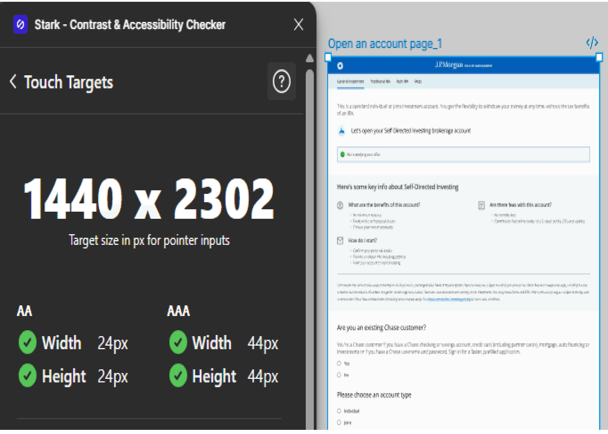
Touch targets
The plugin checks for the recommended target size.
The result was that all the UI screens, successfully passed the three accessibility checks.
Designing responsive UI helps to understand the different constraints / patterns followed for desktop and mobile.
The end goal of the Self-Directed Investing site is to convince the user to open an account, for which the UI should be simple, intuitive and easy to use.
Key takeaways/Learnings
The navigation is simplified and the CTA’s of the three account types are placed at the top of the landing page, such that the user makes a quick decision to choose and create an account.
Reducing the number of clicks creates a delight factor for the user.
Redesign of Self-Directed Investing site by J.P. Morgan Wealth Management


Role
User experience and interaction design
Duration
1.5 months
What I did
Everything - solo project
Lets cut the chase and skip directly to the solution. Shall we?
Introduction
What are we looking at?
The process that I followed to identify the problem -
Went to the official website of J.P. Morgan
Opened the Chase site
Got to the Investing by J.P. Morgan tab on the top navigation bar
Came across Invest on your own page, which will be the topic of this case study
User experience/User Interface issues identified while going through the landing page of Self-Directed Investing site


Listing the business goals tied to the above stated UX issues
Consistent UI will promote brand loyalty and reduce drop-off rates.
Good user experience across the devices will be helpful in building positive brand perception.
By reducing the number of clicks and avoiding the user being redirected to a completely different site just to view the FAQs, conversion rates will increase, and abandonment rates will dramatically decrease.
Research
According to the Diverse Investor study 2024, majority of the users who had a Self-Directed Investing account were millennials (60%).
Naturally, my next step will be to understand their behaviors, wants and needs
It should be easy for the user to navigate in the portal.
The site should provide a personalized experience.
Consistent user experience should be followed for the mobile app as well since the millennials prefer mobile-first design.
Self-service option like FAQ’s should be readily available so that they can find information quickly.
These are some of the pointers that I kept in mind while designing the solution.
Defining the problem
Problem statement/Challenge
Redesigning the Self-Directed Investing homepage and improving the user experience of its adjacent pages like General Investment, Traditional IRA, Roth IRA and FAQ so that the site gets repeat customers.
Before unfolding the solution, let’s dive into some of the “How might we” statements


Current user flow
Landing page of Self-
Directed Investing site
Click on open account CTA
Modal pops up with three options to choose from
User clicks one of the options and the relevant page opens
User has to go back again and click on the CTA to select other option on the modal
If user has any question he clicks on the FAQ link in hamburger menu
FAQ link redirects the user to a new site
Optimized user flow
Redesigned landing page
of Self-Directed Investing site
Click on open account CTA
User gets redirected to a
page which has three tabs i.e. General Investment,
Traditional IRA and Roth IRA
If user has any question he
clicks on FAQ link on the
same page
FAQ section is available on the landing page
Utilizing the Salt design system to create high-fidelity designs
Leveraging the design system which includes reusable components, typography, color palettes and iconography to give a UX makeover to the Self-Directed Investing site.
Reference link to the Salt design system: https://www.saltdesignsystem. com/salt/getting-started/designing
Ideation phase
Introducing the low-fidelity wireframes which will help in creating the layout of the solution (it will also act as a guiding light for the solution)
Desktop
Landing page
Open an account page
Mobile
Homepage
Open an account page

My playground

Solution
Revealing the final solution a.k.a the high-fidelity designs
Landing page (Desktop)
Before

After
Inconsistent usage of colors creates a disconnect in the mind of the user, so the first step is to make it consistent throughout the page.
Removing the hamburger menu and instead, introducing tab design as it is a preferred practice in desktop view.
Including imagery in the hero section, to enhance the look of the page.
The layout and hierarchy of the page is also improved, as the important section like choosing a type of account is moved to the top.
On click of ‘Click to open account’ CTA, earlier a modal appeared, so now in the redesign instead of redirection of the types of account pages to three separate pages, I clubbed them into one page and introduced tab design to reduce the number of clicks.
In the before version, the FAQs were hidden in the hamburger menu and it was redirecting to a separate page with different branding, so to make it convenient for the user to view the FAQs I added them at the top of the footer.
Text of the footer is reduced and it is properly organized.
General Investment page (Desktop)
Before
After
The user can easily switch between pages through the tabs at the top.
Including a short description for each type of account page, to remove decision fatigue for the user.
In the previous UI, the content was center-aligned but in order to maintain consistency with the landing page, I left-aligned it.
Shifting the need help container above the footer in the new layout.
FYI: For the Traditional IRA and Roth IRA pages, majority of the content remains similar to the General Investment page with minor changes like description and headings.
Prototype: Mobile
Did a quick accessibility check for all the UI screens
Found a plugin on Figma which does contrast and accessibility check - Stark

Contrast check
The Stark plugin does AA as well as AAA checks for contrast according to the WCAG standard.

Typography check
The plugin checks for the ideal font size and text alignment.

Touch targets
The plugin checks for the recommended target size.
The result was that all the UI screens, successfully passed the three accessibility checks.
Key takeaways/ Learnings
Designing responsive UI helps to understand the different constraints/ patterns followed for desktop and mobile.
The end goal of the Self-Directed Investing site is to convince the user to open an account, for which the UI should be simple, intuitive and easy to use.
Reducing the number of clicks creates a delight factor for the user.
The navigation is simplified and the CTA’s of the three account types are placed at the top of the landing page, such that the user makes a quick decision to choose and create an account.
View next project

View next project
